Creating a calm and peaceful environment in your home starts with the right choice of colors. Colors have a powerful impact on our mood and emotions, and choosing calming hues can help transform your living space into a tranquil retreat. Whether you’re painting a single room or refreshing your entire home, these tips will guide you through selecting colors that promote relaxation and harmony.
Why Choose Calm Colors?
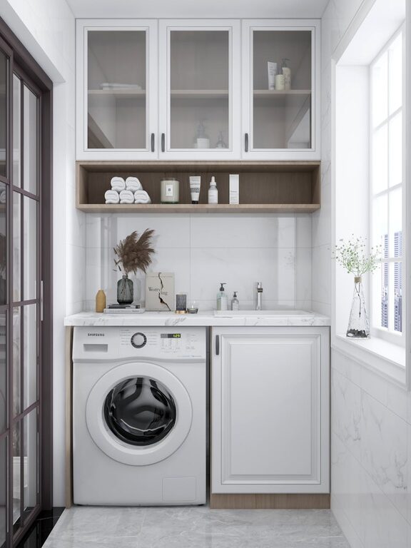
Calm colors are soft, muted tones that help reduce stress and create a soothing atmosphere. They can make a room feel more spacious, airy, and inviting. Unlike bright and bold colors, calm shades are less likely to overwhelm your senses and are perfect for bedrooms, living rooms, and any area where you want to unwind.
Understanding Color Psychology
Before picking a color, it’s useful to know how different hues affect your mind:
– Blues: Often associated with tranquility and stability, blue tones can lower heart rate and create a serene mood.
– Greens: Green evokes nature and balance, promoting relaxation and a sense of renewal.
– Neutrals: Soft beige, taupe, and gray create grounding backgrounds that pair well with accent colors.
– Lavender and Soft Purples: These shades encourage calmness and creativity.
– Pale Pinks and Peaches: Gentle warm tones that feel comforting but not overpowering.
Tips for Choosing Calm Colors
1. Consider the Room’s Purpose
Think about how you use the space. Bedrooms and reading nooks benefit from cooler hues like blues and greens, which encourage rest. Living rooms and kitchens may handle warmer neutrals with soothing undertones that invite socializing without overstimulation.
2. Test Colors in Different Lighting
Colors can look different depending on natural versus artificial light. Paint swatches on your wall and check them at various times of the day to ensure the color feels calm throughout.
3. Use a Neutral Base
Starting with a neutral base color allows you to easily add calming accents through decor like pillows, rugs, or artwork. Neutral walls also keep the space feeling open and can be refreshed more easily over time.
4. Limit the Number of Colors
Stick to a simple color palette—two or three main colors—to avoid visual clutter. Multiple calm shades can be layered subtly to add depth without overwhelming the senses.
5. Incorporate Natural Elements
Colors inspired by nature tend to feel most calming. Think soft greens reminiscent of leaves, muted blues like a clear sky, or sandy beige tones. Pairing these with natural materials like wood and stone enhances the tranquil vibe.
6. Use Matte or Eggshell Finishes
Glossy paint can reflect light harshly, while matte or eggshell finishes absorb light softly. These finishes help maintain a calm atmosphere by avoiding glare or reflections that can be distracting.
Popular Calm Color Choices
Here are some reliable colors known for their calming qualities:
– Soft Sage Green: Modern yet natural, perfect for living rooms and bedrooms.
– Pale Blue Gray: Elegant and cool, works well in bathrooms and kitchens.
– Warm Beige: Cozy and inviting, a versatile backdrop for most styles.
– Dusty Lavender: Adds a touch of sophistication without overwhelming the senses.
– Blush Pink: Soft and subtle, it creates a warm and comforting mood.
Creating Balance with Accents
Even in calm color schemes, small pops of color or texture add personality and interest. Consider:
– A muted coral throw pillow.
– Natural wood furniture with rich grain.
– Textured rugs in light tones.
– Soft gray curtains.
These accents complement calm hues while keeping the room lively and inviting.
Final Thoughts
Selecting calm colors for your home is all about understanding how colors influence mood and designing your space to support relaxation and comfort. By choosing soft tones, testing them with your lighting, and pairing them thoughtfully, you’ll create a peaceful environment where you can truly unwind.
Remember, your home should be your sanctuary. Calm colors help ensure every room feels like a welcome escape from the busyness of daily life. Happy decorating!